Hey Stampers,


Hey Stampers,


Hey Stampers,
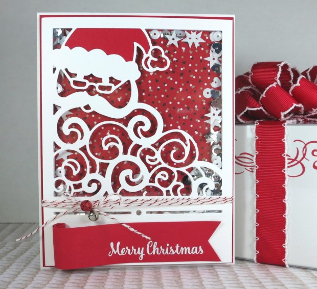
I’m here today to share another fantastic new die set from the new holiday catalog. The Detailed Santa Thinlits dies are a beautiful addition to your collection that just beg for shaker cards!

There are so many things you can do with this set (think inlaid die cutting, shakers, stenciling), but a shaker card just seemed like too much fun to pass up for me. I used two dies from this set, along with some of the new baker’s twine, and the mini jingle bells (yes, you heard that right…MINI JINGLE BELLS!!!).
If you’ve been to one of my classes, then you know I teach a simple four step process for making the shaker portion of cards: cut, cover, fill, and close. If you’ve ever started making a shaker card and poured in some sequins, only to find that you’ve forgotten the window sheet…these steps are for YOU!
Cut: I began by cutting a piece of Whisper White thick cardstock to 4×5.25 inches. I die cut the Santa square first, then cut the border second. I ran the Santa die through my Big Shot one more time with a piece of Real Red cardstock for Santa’s hat.
Cover: Next, I adhered a piece of window sheet to the back of my card front. I used my snail adhesive to inlay Santa’s hat before flipping over my card front to create the shaker portion. Use foam strips to create a border for the shaker portion of your card, fitting the corners tightly together to avoid leaks.
Fill & Close: I filled my shaker with sequins and then added a piece of the Candy Cane Lane designer series paper to seal in the goodies. You can use sequins, punched confetti, seed beads, glitter…almost anything you want as the filling for your shaker card.
I wrapped my baker’s twine around my card front and then tied the bow with two mini jingle bells. These jingle bells actually work and add a delightful little jingle to the rattle of a shaker card. I added additional foam strips to balance the height of the lower portion of my card front and then adhered the entire thing to a Real Red panel measuring 4.125×5.375. Next, I added the whole thing to my card base. In this case my card base is a 4.25×5.5 card cut from Whisper White thick cardstock.

Lastly, I stamped my sentiment and embossed it with white embossing powder. I wanted this sentiment to look like it was on a scroll (think Santa’s list) rather than a standard label, so I used my triple banner punch on one end and stamped fairly close to that end. Next, I added some adhesive (in this case tearing tape) to the back of the far left end and rolled up the paper, using the adhesive to hold my scroll in place. I adhered my scroll using my Fast Fuse adhesive on the scroll end and fast fuse on the sentiment end. That’s it!
Here’s my finished card:
I’ve included all of the supplies I used in the table below. If you have any questions about this project please leave a comment or send me a message. If this card inspires you to make something fun, I’d love to see it!
To see more fun projects, don’t forget to subscribe so you don’t miss anything!
Hey Stampers,
I started with a piece of Basic Black cardstock cut to 9×3 inches and scored it at 3 inches and 7 inches. Next, I added adhesive to the two-inch section to create the basic pocket.
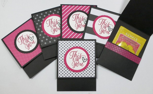
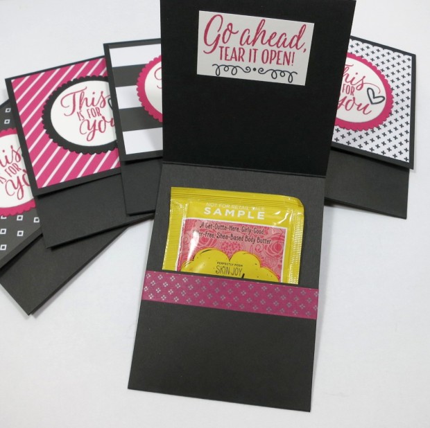
I created similar pockets for Fall using the Petals and paisley set, adding a few copper foil accents for that extra something special.
If you have any questions or this post has inspired you to make something new, please leave a comment, I’d love to see it. For more from my blog here at caseyolin.com please subscribe so you don’t miss a post. If you’re viewing this post on aluminum-butterfly.com, you can subscribe there too!
Hey Stampers,
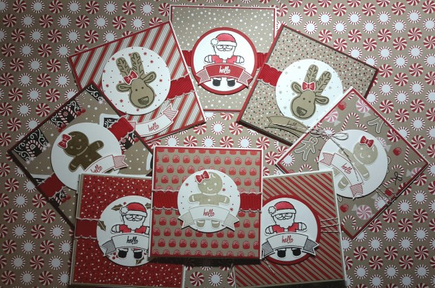
Today I want to show you how I made a set of adorable invitations for my holiday catalog launch party using the Candy Cane Lane suite. They’re mini, they’re magical…they’re too cute for words! Yep, the little critters you can make with the Cookie Cutter Christmas punch have totally stolen the show this year, so I just knew I needed them on my launch party invitations.

I started by pairing the coordinating Candy Cane Lane Designer Series Paper with one of the characters from the Cookie Cutter Christmas stamp set and then added matching cardstock. My card bases are cut from Whisper White thick cardstock at 4.25×8.5 inches (creating a card that’s 4.25 inches square) and scored at the midline. I cut my designer series paper to 4 inches square and sized my cardstock to provide a frame of an eighth of an inch. For this card, I used Crumb Cake cardstock and Early Espresso ink on the reindeer.

For the background on my circle, I used a stamp from the Presents and Pinecones set and Real Red ink. You could also use designer series paper here if you wanted to, but I like the added support of the Whisper White thick cardstock behind my reindeer.

I adhered the designer series paper and cardstock together before adding my stitched edge ribbon (or baker’s twine). I mounted my background to the folded cardstock base and then I used dimensionals to adhere the framelit circle in the center of my card.
I added my reindeer to the center of my circle with Fast Fuse and then stamped, punched, and adhered my sentiment for a finished card. That’s it!
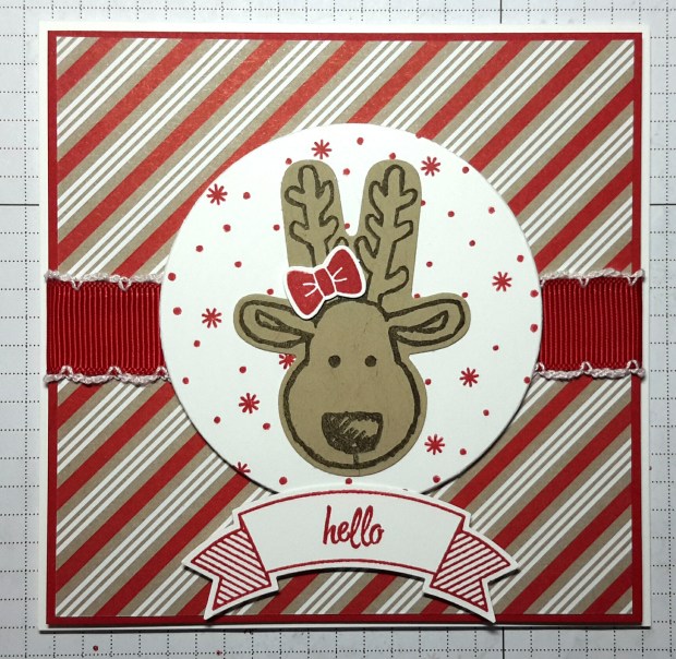
I’ve included all of the products that I used to make the full set of invitations below. Please leave a comment or send me a message if you have questions. If you’re inspired to make something after reading this post, I’d love to see it!
Happy Stamping!
Hey Stampers,
I know you can’t wait for the Holiday Catalog to be released – I can’t either! I have so many new projects to show you in the coming weeks, its going to be mindblowingly (I think I made that word up) amazing. But in the meantime, since I just can’t wait to start turning out holiday cards, lets play with some of the great elements in the Annual Catalog for Christmas.
Today, I’ll be creating a scene reminiscent of the still of night after a snow storm. I’m using a stamp from the Lovely as a Tree stamp set, one of the Lots of Labels framelits, and ink in Basic Gray and Night of Navy.
I stamped my trees in Basic Gray ink on a piece of Very Vanilla cardstock. I’ll end up trimming down some excess after inking, but this gives me a good starting point (especially if I manage to stamp slightly off-center). I use gray ink as opposed to black because it makes it easier to mimic the muted tones of a moonlit evening. Black stands out and doesn’t blend as well, though its perfect if you’re doing a sunset.

I stamped my tree image a second time on a scrap piece of paper and cut around the shape of the hills to use as a mask for inking. Next, I added my “night sky” with a sponge dauber, using my mask to keep the ink of my snow-covered hills. The best way to make your moonlit sky look realistic is to designate “moon location” and make sure that the lightest areas of your background are those where light would reflect the most. Once I finished my sky, I removed the mask and blended a small amount of color into the hills. I completed my hills with my Wink of Stella glitter pen (yes, the dye ink will bleed a small amount, but I let it help me blend my color into the cardstock).

For the top layer, I cut a piece of Whisper White thick cardstock to 4×5.25 and used a Lots of Labels framelits die to cut out the center for my window. I added dimensionals to the back and adhered my scene to my A2 card base and then the window on top. Lastly, I stamped a sentiment on Night of Navy cardstock and added a layered snowflake on one side.

That’s my card for today! Please comment below or send me a message if you have any questions. I list all of my materials for this card in the table below. If this card inspires you to make something similar, I’d love to see it!

If you’d like to take a class on window cards or stamp masking, check my calendar or message me for party with your friends.
Happy Stamping!
Hey Stampers!
The Holiday Catalog release is ALMOST HERE! I can hardly wait to show you the series of goodies we have for the holidays. I’m thrilled to preview you what is easily my favorite bundle of the new catalog. The shapes are stunning, the stamps are beautiful and I just couldn’t help myself…this one HAD to sparkle.

I started by stamping my background star dust image in Sahara Sand on Very Vanilla cardstock cut to 4×5.25. I die cut the star frame as the aperture for my card. I then cut the rest of the layers of my star from Very Vanilla and gold foil cardstock.
I find that I have a particularly difficult time adhering delicate shapes to the glimmer cardstock, so I eliminate this issue by gluing a piece of clear cardstock to the back of my Very Vanilla cardstock panel.
I adhere my glimmer paper to my Very Vanilla cardstock base using Fast Fuse and then prep my glimmer paper for dimensionals. Glimmer paper has such a fantastic sparkle that the effect is incredible, but the tradeoff is a TON of glimmer. I use my bone folder to scrape away the excess glitter in a few spots just to make sure the dimensionals have something to stick to.
I assembled the layers of my focal image and then stamped my sentiment in Sahara Sand. I applied a small amount of ink to the edges of my sentiment cut out to make it easier to differentiate from the card base.
That’s it! Here’s my finished card:

Please comment below or send me a message if you have any questions. I list all of my materials for this card in the table below. If you’d like a class on any of the techniques in this card, let me know. To see more from me, subscribe to my blog and follow me on Facebook. If this card inspires you to make something similar, I’d love to see it!
Hey Stampers,
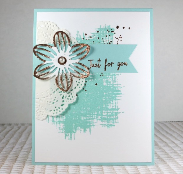
For today’s card I wanted use a technique that, while simple, makes for beautiful looking cards. I needed to make some swaps for an upcoming team meeting and I like doing things that are just a little different for my projects.
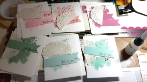
Using a die from the May Flowers Framelit set, thick Whisper White cardstock, Versamark ink pad, and embossing powder, I “gilded” the focal image for each card. I varied the embossing powder with each ink color, but for this card I used Pool Party ink and copper embossing powder.
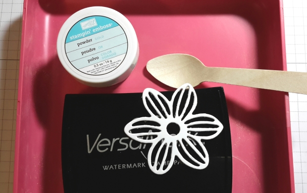
After I die cut my flower, I ran the Versamark ink (somewhat haphazardly) across my petals and then covered them with embossing powder. I set the powder with my heat tool and then did the same thing with a small piece of scrap paper. I used a small circle punch to create a matching copper circle and adhered it to the back of the center of my flower.
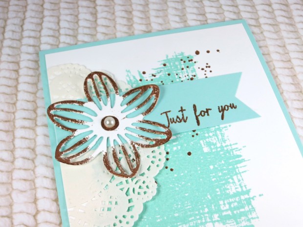
I curled the petals to give it some dimension and then attached my flower beside the sentiment on my card. If you have questions about this technique, please contact me. I’d love to show you how I do it. If this inspires you to “gild” something. Please post it in the comments below, I’d love to see it!
If you have questions about any of the products I used, I’ve listed them below (for the full set of cards).
Hey Stampers,
Today I wanted to talk about a way to get a little more mileage out of your stamps. Anytime I can find a new technique to use with what I already have, I’m thrilled. Undoubtedly, you have some smaller stamps (or even some choice larger ones) that would lend themselves to this technique. You don’t need any special tools, just a few stamps and inks and maybe an acrylic block (if you aren’t using wood-mounted stamps).

I find that the majority of the backgrounds that I make are floral, so that’s what you’ll see in my examples, but you can make any kind of pattern you’d like.
I start with a smooth, solid colored piece of paper that’s cut to fit my card base. For these examples, I used whisper white cardstock. I’ll select my stamps and ink colors based on my card theme and color scheme and play with a basic design on a piece of scrap paper.
Regardless of the relationship (pattern) I determine I want, I always work from one corner (top left for me) to the opposite corner. I find that working in a diagonal pattern keeps me from ending up with awkward blank spaces. I start stamping in the corner and then alternate my stamps across the paper until my background is complete. Don’t be afraid to stamp all the way off the page! I find that it gives my background a “finished” look (like you cut it from a larger piece of paper).

If you have any questions about today’s technique, send me a message or leave a comment below. Happy Stamping!
Hey Stampers,
Today I wanted to share a simple card I made with the Watercolor Wash background stamp. I love the look of this stamp and normally, if I want this nackground, I have some painting and prepping (and waiting) to do. Well, I didn’t want to wait…so I thought I’d see what I could do with just two stamps and some embossing powder.
I used some Whisper White cardstock and Blushing Bride ink for my background and I chose a fairly large sentiment from the One Big Meaning stamp set. I love this color combination, but I found that mounting this background on a Blushing Bride paper panel was pretty boring. I thought about using a piece of foil cardstock, but I wanted the “golds” to match.

The best way to match an embossing powder is (you guessed it) to use the same embossing powder for the backing. I used my Versamark clear ink pad to give myself a narrow border and then heat embossed it with the same gold powder I used for the sentiment. Add a few sequins and there you have it, a perfectly elegant simple card! If you like the look, try it with different colors or sentiments. I’d love to see what you come up with!

Hey Stampers,
I’m excited to preview the cards we’re making at this month’s card class. We’re doing a “fun fold” class and focusing on our holiday items. It will be a great time with friends, learning new techniques for wow cards and getting ahead on the Christmas to-do list!

Each lady will learn two different card folds AND make two matching boxes for treats and presents using Stampin’ Up! punch boards, dies, designer series paper, and embellishments. If you’re going to join us this weekend, I can’t wait to see you! If you’d like to book a party or workshop with me, contact me here. 🙂